Walmart - Me@Campus App
Background / Context
Role: Lead Platform Designer
Tools: Figma, Miro, UserZoom, Jira
Duration: June 2023 - March 2024
Platform: Mobile & Web
Work-related information was dispersed among various applications, posing challenges for Walmart corporate associates to access critical data efficiently. To streamline accessibility, we are consolidating these disparate applications into a unified platform known as Me@Campus.

“How might we maintain design consistency while integrating experiences across diverse apps, empowering users to discover and complete their essential tasks?”
Structure explorations
Given the fact that there are so many mini-apps coming in Me@Campus, the app structure needed to be flexible enough to house all of them. I've conducted a competitive analysis and looked at the structures that were adopted in apps of different sizes.

I've identified three structures in web: 'Conventional nav', 'Side nav', and 'Hybrid'. 'Side nav' structure suits Me@Campus the best as it supports scalability and transparency of navigation options. The 'Hybrid' structure is adopted by mega-size applications like e-commerce websites. We can consider adopting the 'Hybrid' structure in the future, but we're sticking to the 'Side nav' structure for now.

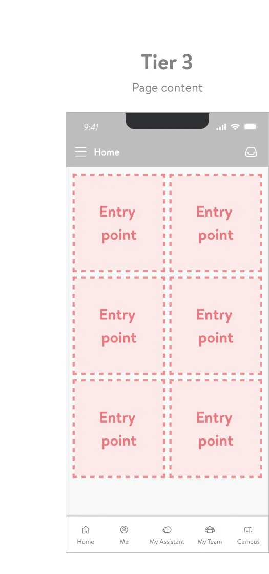
Tiered entry point
Me@Campus is growing fast with new mini-apps fighting over entry points for better discoverability. I've designed 'Tiered entry point' to ensure that the most deserving mini-apps receive prominent placement or visibility within the platform. We are leveraging research(card sorting) as well as analytics & metrics to determine tiers of respective mini-apps. This approach aims to optimize user experience and simplify navigation.


Design Governance
There are 14 mini-apps and over 20 designers across Me@Campus space. We need a way to keep consistency with speed and accuracy.


3 Key Measures for Design Consistency
1 - Me@Campus subsystem
Mini-app designers can easily drag&drop master components from the subsystem into their Figma file. I was overseeing the execution and maintenance of the subsystem by designing, refining, and documenting intuitive and scalable components.
2 - Playbook meetings
Held bi-weekly, I've facilitated the Playbook meetings to announce and discuss new updates within the Me@Campus subsystem, ensuring that all team members are informed and aligned with the latest developments.
3 - Design reviews
Mini-app designers have the option to schedule review sessions with our core team to make sure the design meets Me@Campus standards, further ensuring consistency across the platform. This also serves as an opportunity for the Core team to identify gaps between mini-apps.

Component
Design at Walmart is governed by its design system called Living Design. However, while LD serves as a foundation, it doesn't encompass all the use cases encountered by the Me@Campus team. We've developed a subsystem specifically for Me@Campus, which consists of 'Components' and 'Best practices'.
Icons
Icons play an important role in conveying a message to the users due to their speed and conciseness. Throughout our platform, we've maintained a consistent use of icons, with each icon reflecting the corresponding mini app tied to the experience.
Media Type
At Me@Campus, we strive to use a consistent styling of media type. Real photography is used to celebrate Walmart associates, while illustrations serve to simplify complex concepts.

Responsive Design
Me@Campus is fully accessible across a range of device sizes, including 'Small,' 'Medium,' and 'Large'. I've designed responsive Core structure as well as adaptable column layout optimized for each breakpoint, guaranteeing seamless interaction regardless of the device size.
After Launch Q4'23
We've got 30,000 out of 50,000 active users in our Me@Campus app and our clocking solution saves $36M per year from hourly associates cost.
