T-Mobile - Bill Comparison
Background / Context
Role: Lead designer
Tools: UXPin, Figma, Jira, Rally
Duration: April 2022 - Sep 2022
Platform: Mobile & web

Project Summary
The goal of this project was to enhance the customer experience by enabling users to compare their current and previous month’s charges and credits. This feature aimed to reduce calls to Care by providing clarity and transparency. In collaboration with the Atlas (Care) team, we ensured seamless integration between customer and care experiences, resulting in a cohesive and user-friendly solution.
Problem
Over the past year, Care received approximately 10.3 million calls, with 30% of those requiring a representative to compare more than two bills to explain changes. On average, it takes 20 minutes per call to review the bill, leading to extended call resolution times (CRT). Customers often reach out to Care to understand how account changes affect their balance, especially when these changes span more than two billing cycles.

Goal

The goal of this project is to create a seamless, user-friendly mobile experience that leverages data from two consecutive billing cycles to provide customers with a clear, concise explanation of their charges and any changes. By simplifying bill explanations, the project aims to reduce calls to Care and enhance the overall customer experience through intuitive, self-service solutions.
Inspiration & Competitor Analysis
I examined existing experiences that offer side-by-side comparisons of products or services, focusing on how they address pain points related to understanding differences and changes. This analysis included studying visualizations, data presentations, and infographics to inform our approach. These insights helped shape a more intuitive and effective user experience for comparing billing cycles.


User Flow
Mapping the current experience revealed several pain points in the customer journey:
Mismatched information between the bill PDF and My T-Mobile screens for current and previous charges
The overview section lacked relevance for customers reviewing past bills
No reference to previous amounts, making it difficult for customers to understand billing changes
Select image to enlarge
Initial Explorations
Exploration 1
select to enlarge
Dropdown to compare billing change dates
Tabbed navigation to select categories
Toggle to highlight specific changes
Modal for detailed information
“Show more” carrot for expanded details
Exploration 2
select to enlarge
Side-by-side bill comparison
Preselected dates in the bill summary
Dropdown for category selection
“What Changed” information link
Modal for detailed breakdowns
Design Challenges / Iterations
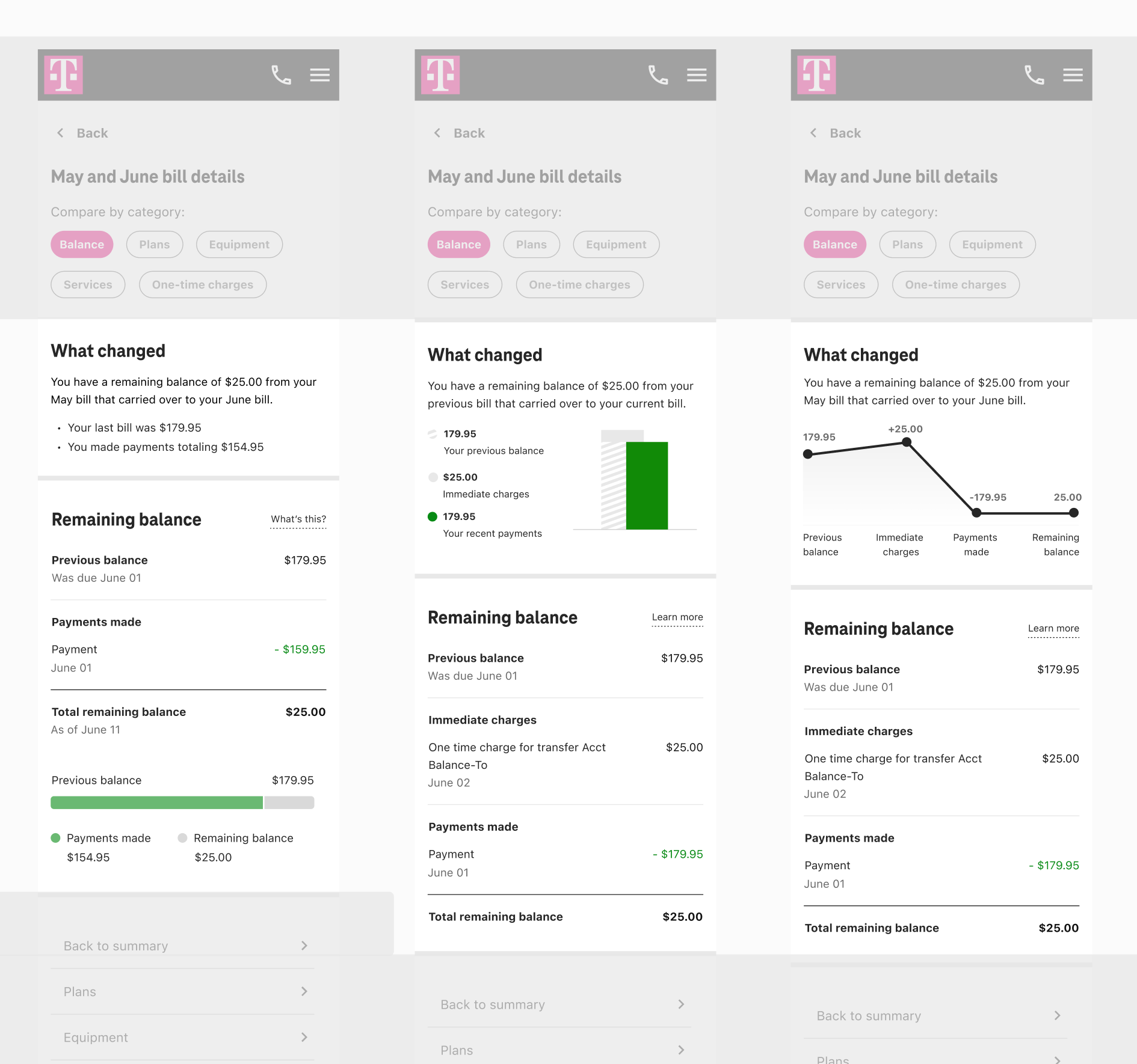
Visualization
I explored and tested multiple iterations of data visualization methods. The key insight was to keep data sets minimal and visualization elements simple, ensuring clarity and usability. This approach allowed users to quickly understand the information without being overwhelmed by complexity.

Headers & Sections
User testing revealed that the visuals in both bar and line formats were confusing. I decided to streamline the design by sticking to one contextual version of the text information related to the bill summary, with more detailed explanations provided in the remaining balance section. This approach improved clarity and user comprehension.
Bill picker
I explored various ways to improve the bill selection process between two consecutive bills. I tested multiple concepts, each focusing on factors such as the number of clicks, research data on previous bill inquiries, date selection, and interaction methods. These iterations helped identify the most efficient and user-friendly approach.
Concept A

Concept B


Usability Study
As part of the usability study, I conducted tests to evaluate the effectiveness and clarity of the redesigned interface. Participants were asked to perform specific tasks, such as comparing consecutive billing cycles and interacting with the new bill picker. The study focused on identifying pain points, user confusion, and areas of improvement. Feedback was gathered through both direct observation and post-task surveys, allowing me to iterate on the design. The results helped refine features, enhance user flow, and ensure an intuitive, seamless experience.