Walmart - Associate Search
Background / Context
Role: Staff Lead Designer
Tools: Figma, Miro, JIRA
Duration: June 2023 - Present
Platform: Mobile & Web

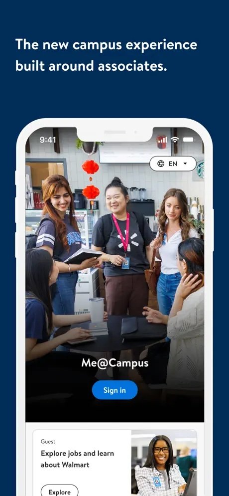
Me@Campus is a comprehensive enterprise application for Walmart associates, available on both mobile and web platforms. It seamlessly integrates personal and work-related needs into a single, easy-to-use app. Key features include managing work schedules, requesting time off, swapping shifts, and more. Need to update your home address after a move? Looking for training certificates due soon? Me@Campus is your go-to solution for these tasks and beyond, making it the most robust and rapidly evolving tool for Walmart associates.


Problem
Walmart associates were using multiple, disconnected tools for finding and connecting with colleagues. The goal was to centralize these directories into a single, intuitive search experience within Me@Campus, providing efficient access to contact and organizational information, all while adhering to Walmart’s privacy and design standards.
Design Challenges & Considerations
Platform Integration: We needed to create a cohesive search experience that could pull data from multiple internal systems and tools. Integrating these sources required designing a modular interface that could adapt to various backend data while preserving performance and search speed.
Privacy Controls: We prioritized privacy by implementing role-based visibility, ensuring that each associate saw only the information they were authorized to access.
Consistency in Design Language: To provide a cohesive experience, we aligned our design with Walmart’s established patterns, enabling a smooth transition for existing users while supporting the learning curve for new features.
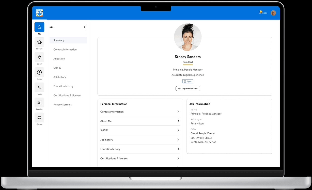
Feature Decisions: We carefully evaluated which details to make visible, such as public profiles, contact options, and reporting structure. Including only essential information and communication tools allowed us to keep the interface uncluttered and focused on core needs, enhancing usability and reducing cognitive load.
Competitive Analysis & Inspiration
To inform my approach, I examined search functionalities in consumer and enterprise platforms like Facebook, LinkedIn, and Amazon’s internal employee directory. This analysis offered insights into user expectations around search efficiency, profile layout, and discoverability, which we adapted to meet Walmart’s unique requirements.

Design Iterations & Problem-Solving
Creating the associate search experience for Me@Campus involved multiple rounds of iteration to refine the interface and resolve key challenges, especially around data integration, usability, and privacy. Here’s a breakdown of the iterative journey and the creative solutions applied to land on the final design.
Initial Prototypes & Challenges In the early stages, I presented several wireframe concepts to the team to gather feedback and iterate on functionality and layout. Key prototypes included:

Concept A: Embedded the search functionality within Me@Campus, maintaining consistent navigation patterns.
Concept B: Positioned an inline search option in the header for ease of access.
Concept C: Featured a home screen launch point with direct access to search, leading to a full-page experience with filters.
Concept D: Combined elements from previous concepts with a profile-focused split layout for easier information retrieval.
After testing, Concept C emerged as the best solution. It offered high efficiency in user flow, provided a dedicated search page, and laid a solid framework for associate search.
High-Fidelity Prototyping & Feature Refinement
I took Concept C to high-fidelity in Figma, incorporating user-friendly filters (e.g., location, org structure) and a profile view that highlighted essential contact information. This version was well-received during usability tests, where associates appreciated the focused layout and ease of locating relevant details.

Iterative Feedback & Final Design Enhancements


1. User Feedback Loops: Conducting usability testing and gathering feedback from associates via MyAssistant, we discovered users wanted more discoverability, saved searches, and quick access to frequently searched colleagues. These insights led to enhancements, including recent searches and an org chart view that provided a visual representation of reporting structures.
2. Enhanced Profile Features: In response to requests for better communication tools, we integrated features like direct messaging, Teams calls, and connection suggestions to facilitate networking. This also included connection modals for networking suggestions and the ability to set up 1:1 meetings.
3. Optimization for Discoverability: To improve accessibility, we moved the associate search function to the homepage and added tooltips and walkthroughs similar to Walmart’s native experience. This approach leveraged iOS Native Tip Kit features, providing first-time users with guided steps to familiarize them with the tool.
4. Responsive Design for Desktop & Mobile: Simultaneously developed for desktop and mobile, we maintained consistent functionality across platforms. This cross-platform development leveraged insights gained from mobile to optimize desktop interactions, ensuring a seamless user experience.
Final Prototype
Associate Search
Org Chart View

Desktop / Web
Results & Metrics
Final design was released in the last quarter, including a dedicated search page, a profile page with communication options, and an interactive org chart. Key outcomes included:
Increased Tool Utilization: Adoption increased as associates found Me@Campus more useful and comprehensive, reducing reliance on outdated tools.
Performance Metrics: Internal usability teams tracked metrics, with improvements in:
System Usability Scale (SUS): Indicating higher satisfaction
Average Visit Time (AVT): Increased, showing sustained engagement.
Optimization Metrics: Faster load times and smoother transitions, enhancing usability.